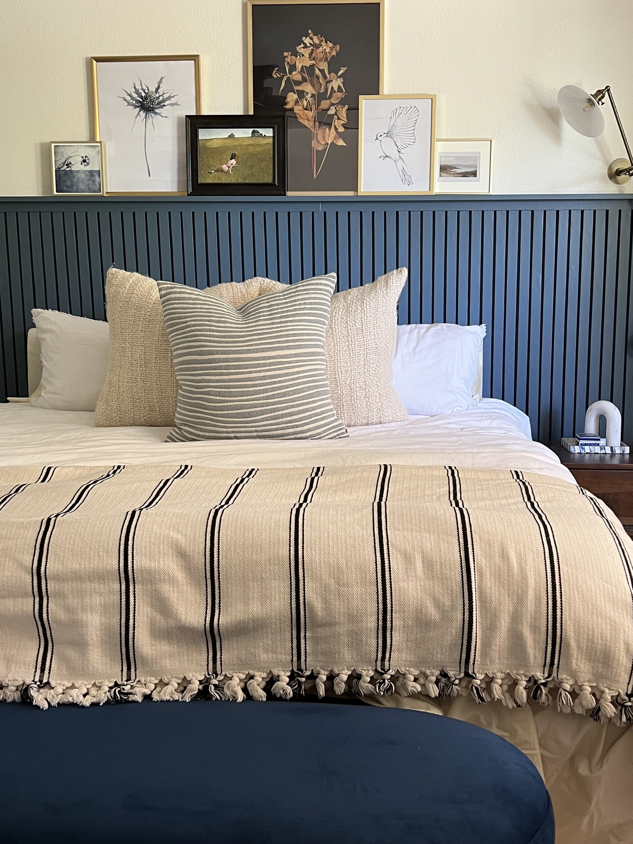
Mountain Adobe Master Reveal
Home Is Where You Sleep
As I designed this Master suite I spent a lot of time finding rich and beautiful tone, textures and materials to bring a calming and comforting essence. The descriptive words used were ‘Warm, calm, and serene’ while the other parts of their home are designed lighter and bright, a little more modern they still have a sense of warmth. To break off from the more green color scheme we chose a completely different color and used rich wood tones like in their modern asian loft space. Their bedroom represents their joint vision of home. As the other spaces one or the other took a more dominant stance on what their vision was this room became a partnership of vision and execution.
Waiting, Waiting, Waiting…..
A good reveal brings such intense rush. When you work so hard to bring your clients design to life. The phase 1 of this project has taken long 9 months. We waited and waited for furniture, art, decor, light fixtures and accessories. From one designer to another or to a client nothing ever works exactly as planned….. from 2020-2022 there has been a shortage of all things construction. Between wood, fabric, shipping delays, factories shutting down, supply change shortages. It all combined made my job harder! From long waiting, delayed and delayed again shipping dates. It went from one thing to another not showing up, showing up broken or damaged, then waiting longer and longer. But we have made it past the Phase 1 of this project. Let’s take a look at what was designed.
Evolution of Design
There is misconception on what a space should look like. Those who find a traditional or eclectic home may not see the beauty in a Contemporary or very modern spanice. As a designer my own personal design preferences are across the board. Being versatile in all type of design allows creativity and ultimate understanding of your clients wants and needs. I am asked on almost every consult I go to “what is your design style” I truly don’t have one! I can go from a very eclectic and vintage space to a very modern choice and find some much beauty in it all! This isn’t a one horse pony and to be unique in your designs allow your client to now just have the same house as all of my other clients.
While I wouldn’t typically design a modern asian home I find it extremely creative for me to bring a whole new perspective and twist on their space. While it isn’t traditional asian style we brought nightstands, Beautiful pottery, and a more oriental rug to tie it all in with their over all theme.
Red/ Navy rug | Ivory Throw Pillows | Blue Throw Pillow | Stripped throw Blanket | Blue Velvet Bench | Linen Duvet Cover
What A Little Paint Can Do!
Keeping it simple we stuck with our base wall and trim color but added a twist in the accent wall. We used SW: Swiss Coffee for walls & Ceiling & Thunder For the trim and & doors. We wanted a focal point for the bedrooms so we drew inspiration from the photos below.
When we picked a more modern skinny slat wall ( Far right example) we had to pick the paint color that would tie in to the rug. We picked “Freedom Found By PPG”
Follow us on Social Media and subscribe to recieve update on all new blogs!


